GKG Tone Timeline Visualizer

Dataset: Global Knowledge Graph
Description: Creates a timeline of the smoothed average tone by day of a search, along with a CSV file for importing into external software.
Components: PERL, R
Acknowledgements: Makes use of tools from the GDELT World Leaders Index.
Example: Timelining Tone.
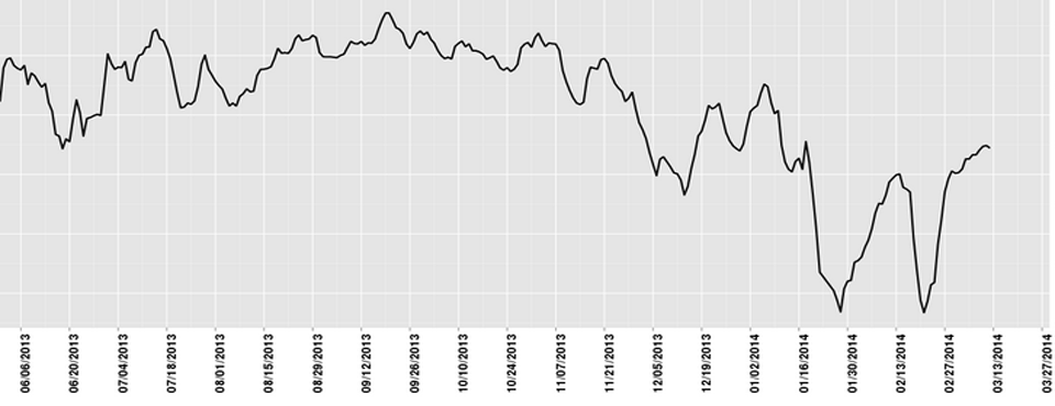
The GKG Tone Timeline Visualizer allows you to plot the average "tone" from extremely positive to extremely negative over a search of the GDELT Global Knowledge Graph (GKG), creating a beautiful publication-ready visualization of how emotion is changing over time and outputting a .CSV file that can be imported into other statistical and visualization packages for further analysis. No programming or technical skills are required - you simply specify a set of person or organization names, locations, or Global Knowledge Graph Themes, along with an optional date range, along with which field you would like to visualize (names, organization, locations, or themes) and the system will automatically search the entire Global Knowledge Graph for all matching entries and calculate the average tone, from extremely positive, to extremely negative, of the results by day over time. Your results will be emailed to you when complete, usually within 10 minutes, depending on server load and the time it takes to perform the analysis.
All GDELT Global Knowledge Graph records are scanned for your search parameters and the average emotion of the underlying records is averaged by day. Thus, selecting "Nigeria" as your search criteria will generate a timeline of how the tone of coverage of Nigeria has changed over time, as well as a .CSV file with the results for import to an external statistical package.